CPI Softer but Higher Unit Labor Costs (ULCs) Remain Problematic
A sustained slowdown in inflation (the Fed’s clear goal) will require a sustained slowdown in economic activity — creating slack and driving down Unit Labor Cost growth. A key economic mantra is “Unit Labor Costs are a key driver of inflation”, with ULCs calculated as follows:
Unit Labor Costs = Pay Growth – Productivity Growth
In 2Q, both were inflationary. Compensation growth was a rapid 6.7% Y/Y, and productivity plunged by a record (yes, a record) -2.6% Y/Y, driving ULCs up 9.5% Y/Y — the most since 1981. So while inflation is likely to slow, as outlined above, ULC growth must reverse on a sustained basis to ensure broad inflation gets down and stays down. Since 1960, there’s an 83% correlation between ULCs and the CPI…the chart is striking, and worrisome.
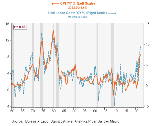 Data as of 08.01.2022
Labor costs continue to be an issue, and we still think they’ll put a floor under inflation around 4%, but that will not be apparent until next year.
Stock/Bond Correlation… Are they now Positive?
Since 2000, the average correlation between American stocks and Treasuries has been negative, at -0.5. But the recent rout in both stock and bond prices has tripped up investors who might have positioned for a continuation of that beneficial zig-zag. In the first half of the year the S&P 500 shed 20.6% and an aggregate measure of the price of Treasuries lost 8.6%. Is this an aberration or the new normal?
The answer depends on whether higher inflation is here to stay. When economic growth drives asset prices, stocks and bonds diverge. When inflation drives them, stocks and bonds often move in tandem. On August 10th, US inflation data showed prices did not rise in July. Stocks soared—the S&P 500 rose by 2.1%—and short-term Treasury prices climbed, too. For as long as central bankers kept a lid on inflation, investors were protected. Yet look back before 2000, to a period when inflation was more common, and you see that stocks and bonds frequently moved in the same direction.
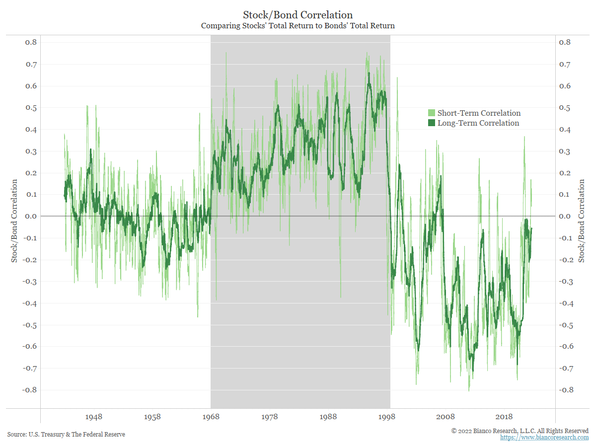 Source: Bianco. As of 8/1/22
The shaded area in the chart highlights the period from 1967 to 1998 when stock and bond returns were positively correlated. Quarterly correlations are shown in light green, while yearly correlations are shown in dark green. During this time, high inflation concerns were the driver of this relationship. When markets were relieved there was no inflation, bond yields went down (prices up) and stock prices went up. When the markets worried inflation was heating up, bond yields went up (prices down) and stock prices went down.
From 1959 to 1967 (and since 1998), this rolling correlation has largely been negative. During this period, the main concern has been a deflationary mindset. When stock prices go up, bond yields go up. Why? When the market worries about deflation taking hold, yields fall alongside stock prices. When the market is relieved that there is no deflation, yields rise along with stock prices.
We believe the stock/bond correlation relationship will define the success or failure of traditional asset allocation (60/40) construction over the next several years… our long term readers know where we stand.
2 Year Yields are Stubbornly High
Yields continue to prove sticky. 2’s are flirting with cycle highs and 10’s (currently 2.9%) are holding some 40bps above their early August lows (hit 2.57%, 8/1/22). Right now, we are teetering back and forth with how high rates will go (terminal rate) and how long they will stay there. The market now expects a higher peak rate of ~3.75% and both fewer and later rate cuts to come next year (higher 2’s is proof). As a result, the yield curve has continued to remain deeply inverted.
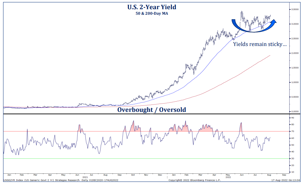 Source: Strategas. As of 8/17/22
July Inflation Was Lower but is 1 Month of Data Enough?
We saw a recent tweet from Harvard economist and former Bill Clinton and Barack Obama adviser Jason Furman:
“Some time periods that you can/should measure and usefully think about inflation over: 1 month 2 months 3 months 4 months 5 months 6 months 7 months 8 months 9 months 10 months 11 months 12 months 13 months 14 months … 23 months 24 months 25 months 26 months 27 months …”
See the Tweet here.
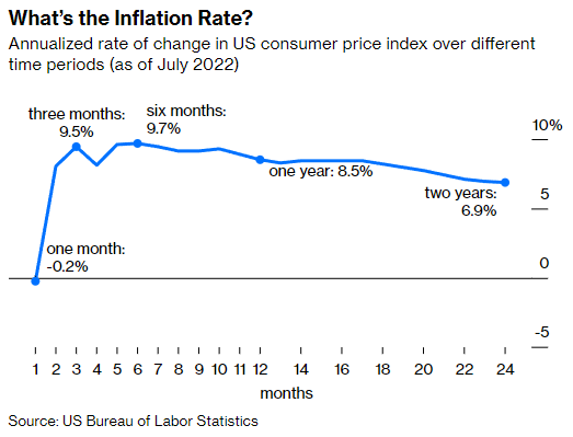 Data as of 8/16/22
The chart above calculates the current inflation over every period from 1 to 24 months, with all the rates annualized to make them comparable. The slightly negative one-month inflation number is the anomaly within the data. The three-month and six-month inflation rates are (when converted into annual rates) even higher than the one-year rate. While July’s price stability could be a forward indicator of lower inflation ahead, it just as likely could reflect the volatility of the price of gasoline, which makes up about 5% of the spending basket reflected in CPI.
Indeed, month-over-month inflation figures are difficult to put into context. In part this is due to their volatility, but it is also difficult to place any meaning on the noise of prices increasing or decreasing by fractions of a percent. The month-over-month figure is important when compared against the Fed’s 2% goal. CPI would need to equal 0.165% each month for a year for the year–over-year number to hit 2%. In that context, it is easier to gauge whether the Fed can begin to take its foot off the breaks in terms of tightening policy.
On a high note, for a reference point, the Cleveland Fed’s Nowcast for August puts monthly CPI growth at 0.19%. If that monthly growth rate were repeated through August 2023, it would put the year-over-year figure at roughly 2.3%, which is likely palatable for Fed officials.
Disclosures
Past performance is not indicative of future results. This material is not financial advice or an offer to sell any product. The information contained herein should not be considered a recommendation to purchase or sell any particular security. Forward looking statements cannot be guaranteed.
This commentary offers generalized research, not personalized investment advice. It is for informational purposes only and does not constitute a complete description of our investment services or performance. Nothing in this commentary should be interpreted to state or imply that past results are an indication of future investment returns. All investments involve risk and unless otherwise stated, are not guaranteed. Be sure to consult with an investment & tax professional before implementing any investment strategy. Investing involves risk. Principal loss is possible.
Projections or other forward-looking statements regarding future financial performance of markets are only predictions and actual events or results may differ materially.
The Consumer Price Index (CPI) measures the change in prices paid by consumers for goods and services. The CPI reflects spending patterns for each of two population groups: all urban consumers and urban wage earners and clerical workers.
The S&P 500® Index is the Standard & Poor’s Composite Index and is widely regarded as a single gauge of large cap U.S. equities. It is market cap weighted and includes 500 leading companies, capturing approximately 80% coverage of available market capitalization.
The 2 Year Treasury Rate is the yield received for investing in a US government issued treasury security that has a maturity of 2 years.
The 10-2 Treasury Yield Spread is the difference between the 10-year treasury rate and the 2 year treasury rate. A 10-2 treasury spread that approaches 0 signifies a “flattening” yield curve. A negative 10-2 yield spread has historically been viewed as a precursor to a recessionary period.
Advisory services are offered through Aptus Capital Advisors, LLC, a Registered Investment Adviser registered with the Securities and Exchange Commission. Registration does not imply a certain level or skill or training. More information about the advisor, its investment strategies and objectives, is included in the firm’s Form ADV Part 2, which can be obtained, at no charge, by calling (251) 517-7198. Aptus Capital Advisors, LLC is headquartered in Fairhope, Alabama. ACA-2208-19.
